
I’m a subscriber of Audible, an Amazon company, where you pay monthly fee in exchange for a pleasant purchasing experience of audio books. I like listening to the audio books while on the go or lying in bed. My smartphone is always by my side, and Audible created a free application for downloading and listening.
As an extra free bonus, Audible’s subscribers can download morning editions of The Wall Street Journal – listen to the latest news and editorials while commuting to/from work or getting to sleep. Nice! This is how the UI looks on my iPhone.
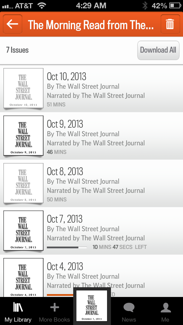
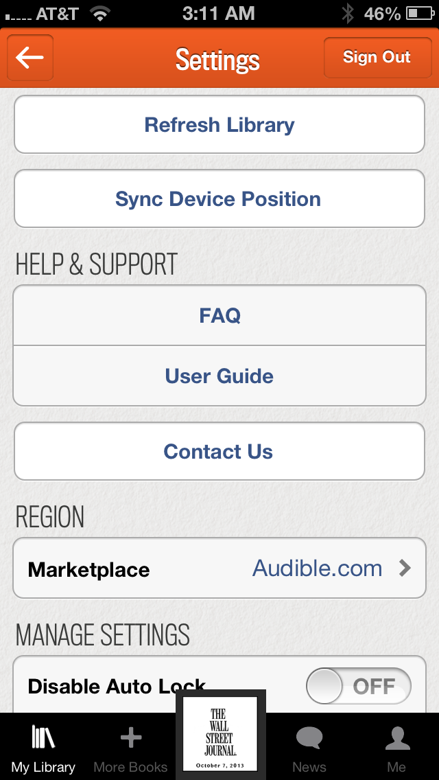
What would you do if today’s edition of WSJ is not shown in this list? The first reflex should be to refresh the list. Any truck driver from Alabama knows that applications that get content from servers should have this curved arrow to refresh the screen. I thought so too. But the Refresh button was nowhere in the vicinities. After multiple clicks I found the Settings screen, where UI designers have hidden the Refresh button. Why on earth would they do this? There were plenty of real estate on the main view toolbars!
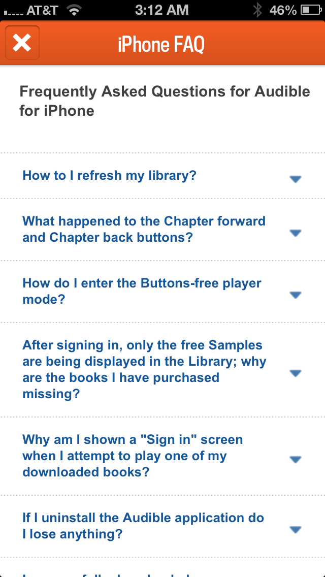
Don’t get me wrong. Audible’s UI designers are not hopeless. They knew that many people would be having troubles finding the Refresh button, so they came up with an unusual solution. They’ve added an explanation of where the Refresh button is in the FAQ section of the app.
Needless to say, that the FAQ itself is hidden under the Settings icon. Well, as Sheryl Crow sang, “No one said it would be easy But no one said it’d be this hard”. But if you’ll find the FAQ, the first item there is “How do I Refresh Library” (ignore the fact that it reads “How to I” – this blog is not about QA). Well, if I get to this screen, the FAQ is sitting right under the “Refresh Library” anyway.
Hopefully, our Alabama truck driver won’t get into an accident while trying to find this well hidden feature. Anyway, as of October of 2013, the iPhone’s version of Audible app leads in my unofficial competition for the worst UI decision.
P.S. See that “Download All” button on the top image? Good luck on canceling dozens of downloads after clicking on it!

Wow Yakov, what a great review! You must really love Audible to make such a great effort in making your point. I do love and use Audible as well and have to step in their defense saying that what was done is a de-facto mobile device standard. Indeed if you check any phone well-known apps: FB, Twitter, g+, LinkedIn they all employ the same pull-down technique to refresh, so majority of truck drivers already used to that and find it easier to pull the list down vs. trying to locate the button a press it as that can be more challenging as buttons are really small and those truck drivers have fat fingers… LOL
In any case, I am sure the Audible appreciates the feedback and will come up with some creative technique, like if you just stare on the list for 30 seconds w/o any action a prompt would appear for 10 seconds saying: pull the list down if you want to refresh.
Again thank you to trying to make one of my favorite apps even better